Case study · 2026
Alarmease
Designing behaviour change at the bedside, so fewer false alarms fire in the first place.
Service Design · Behavioural Change · Healthcare · Systems Thinking
Case study · 2026
Designing behaviour change at the bedside, so fewer false alarms fire in the first place.
Service Design · Behavioural Change · Healthcare · Systems Thinking
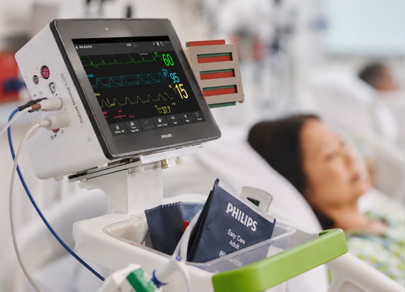
The brief was alarm fatigue. On an emergency ward, most clinical alarms are non-actionable, and nurses learn to stop hearing them. The obvious move is to make the alarms smarter. I spent the first week arguing we should look somewhere else entirely: not at the alarm, but at the moment before it.
Alarmease is a service intervention for the emergency department at OLVG in Amsterdam. It supports nurses in setting a patient-specific monitoring profile at admission, the point in the workflow where most false alarms can still be prevented. It is not one product. It is three small parts that act on the same behaviour from different angles, held together by a service blueprint I built to find the leverage point. My role was the framing, the blueprint, and the physical prototype.
Role
Service design lead. Framing, service blueprint, physical prototype, ethical direction.
Team
Four designers. I led framing and the side reminder; Barbora and Negin led the visual direction; Andy co-built the prototype with me.
Context
Master of Digital Design, Healthcare Playground. One semester, 9 weeks.
Partners
OLVG-Oost, Amsterdam · Philips (IntelliVue Monitor context)
01 · The problem behind the problem
A monitor arrives with generic thresholds. An athletic patient with a low resting heart rate then triggers the same alarm as a patient who is deteriorating. Multiply that across a ward and the real alarm has to compete with hundreds of false ones. Trust erodes, and the alarm becomes background noise. This is a patient-safety risk, not a comfort issue. Almost every existing solution acts after the alarm fires: filtering, routing, smarter alerts. I wanted to know what was generating so many alarms in the first place.
02 · Research, structured before designed
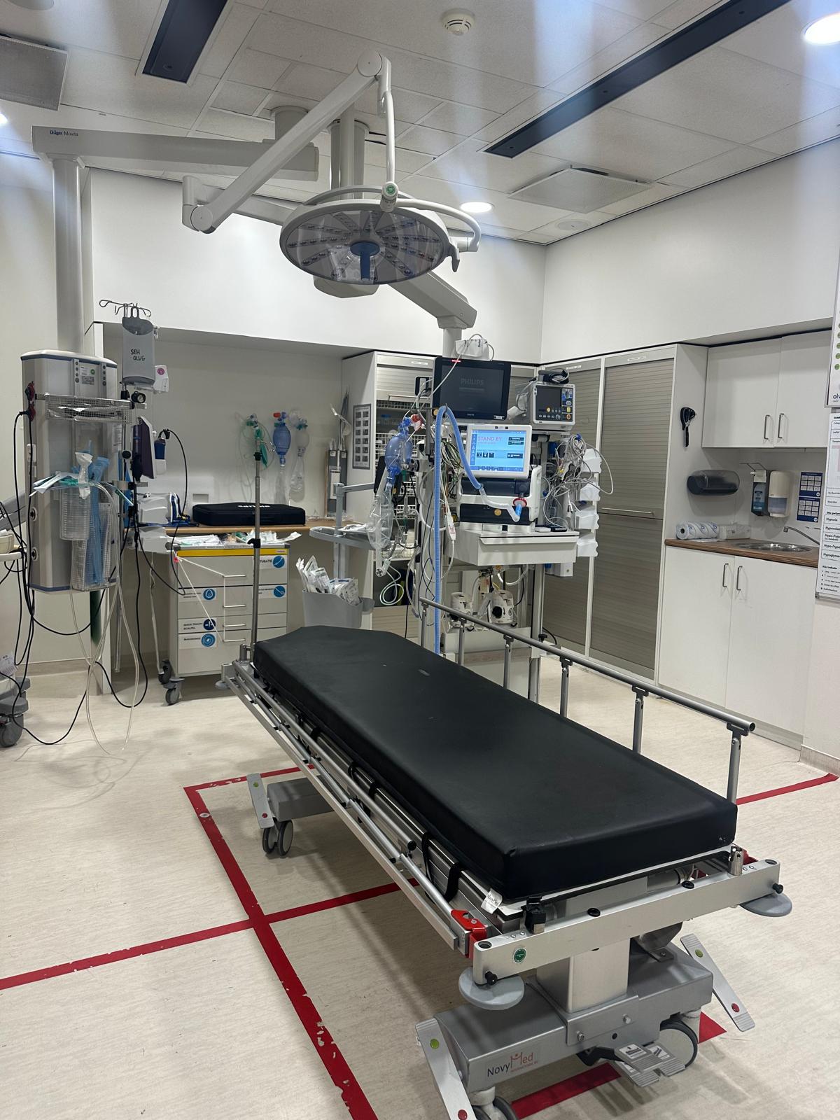
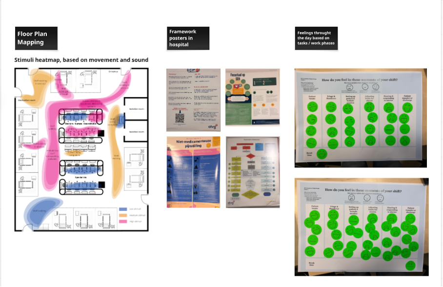
I treated research as a data problem before a design problem. Four source types, deliberately triangulated, because no single source in a short healthcare project is strong enough on its own. Field observation on the ward, mapping how nurses move between beds and competing alarms. An interview with a senior emergency nurse. Rapid mood-mapping across a shift, which turned emotional load into something I could point at: "adjusting limits" and "responding to alarms" drew the heaviest responses. And fourteen peer-reviewed papers. I set one rule for the team: every design decision had to trace back to at least two of these sources, or it did not survive.
03 · The reframe, and the blueprint that made it hold
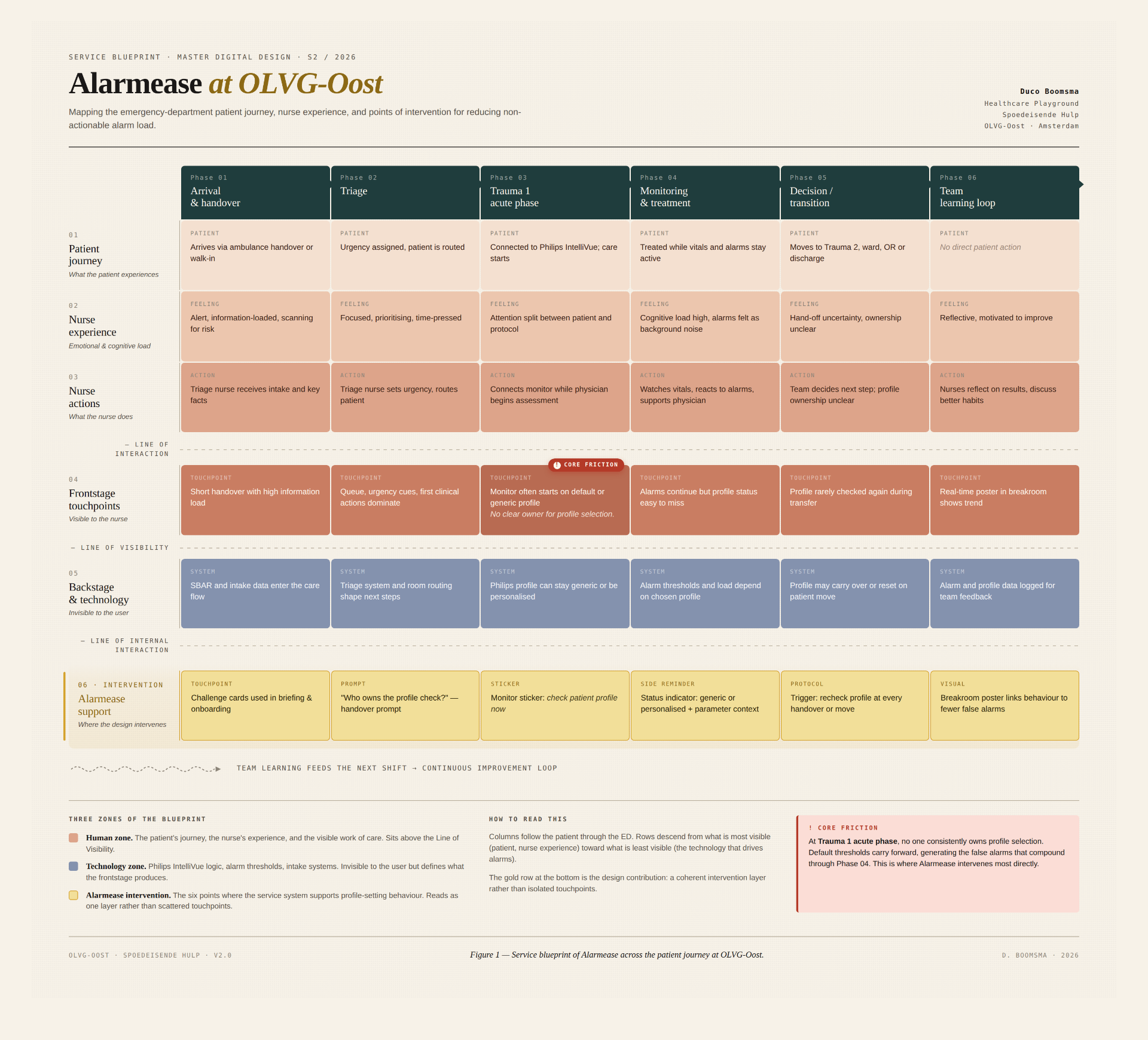
Synthesis pointed at one moment: patient admission, when the profile is set. A personalised profile cuts false alarms at the source. A default profile, copied across patients to save time, multiplies them. So I reframed the brief. From "reduce cognitive load when alarms fire" to "help the right profile get set at admission." To make that shift survive contact with a team of four, I built a service blueprint across the whole patient journey, from arrival to handover. It surfaced a friction no interview had stated out loud: at the trauma acute phase, no one clearly owns profile selection. Nurses assume the doctor decides. Doctors assume it is handled. The behaviour falls between two roles. That gap became the thing the whole project designed for.
04 · From many ideas to one direction
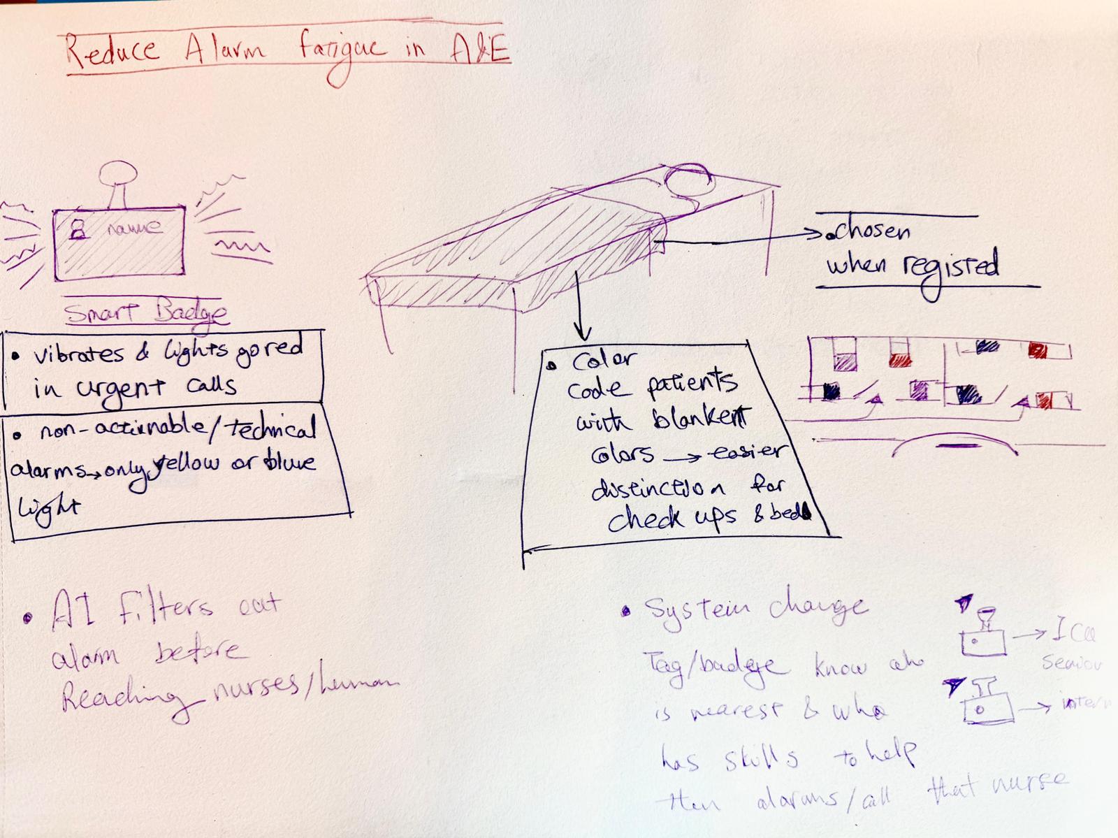
The team generated widely: smart badges, colour-coded beds, AI voice-to-text, ambient light columns. Most of it I argued against, and the reasons mattered more than the ideas. Anything that added a screen added another thing to check. Anything that tracked an individual turned support into surveillance. The blueprint became the filter: where does this sit on the journey, and who owns the action. Ideas that could not answer that were let go.
05 · The behavioural lens
Setting a profile is a behaviour, not a feature. Through Fogg's model, motivation and ability were already there: nurses hate false alarms, and the monitor supports adjustment. What was missing at admission was a trigger, and afterwards any feedback that the effort had paid off. A COM-B check added one thing: newer staff often do not yet know profile-setting is part of their role. So the intervention had to do three jobs at once. Trigger the behaviour, feed it back, and quietly socialise it for people still learning the ward.
06 · The intervention: three parts, one behaviour
Each part is in the medium that lets it stay small. That restraint is the design, not a side effect of it.
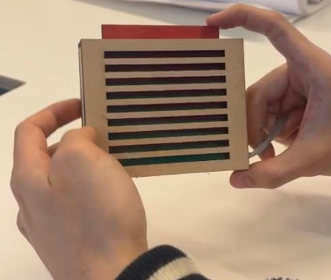
The side reminder, the part I built. A small physical object beside the monitor. A spring-loaded button, modelled on the satisfying click of a toaster, pressed once a profile has been set. Red until pressed, green after. An earlier version used a magnet. It felt right in a digital prototype and lost all meaning the moment the gesture became routine. The click was the fix: a physical confirmation that something is complete, with no screen and no login. A screen would have asked for input where only confirmation was needed.
06 · Continued
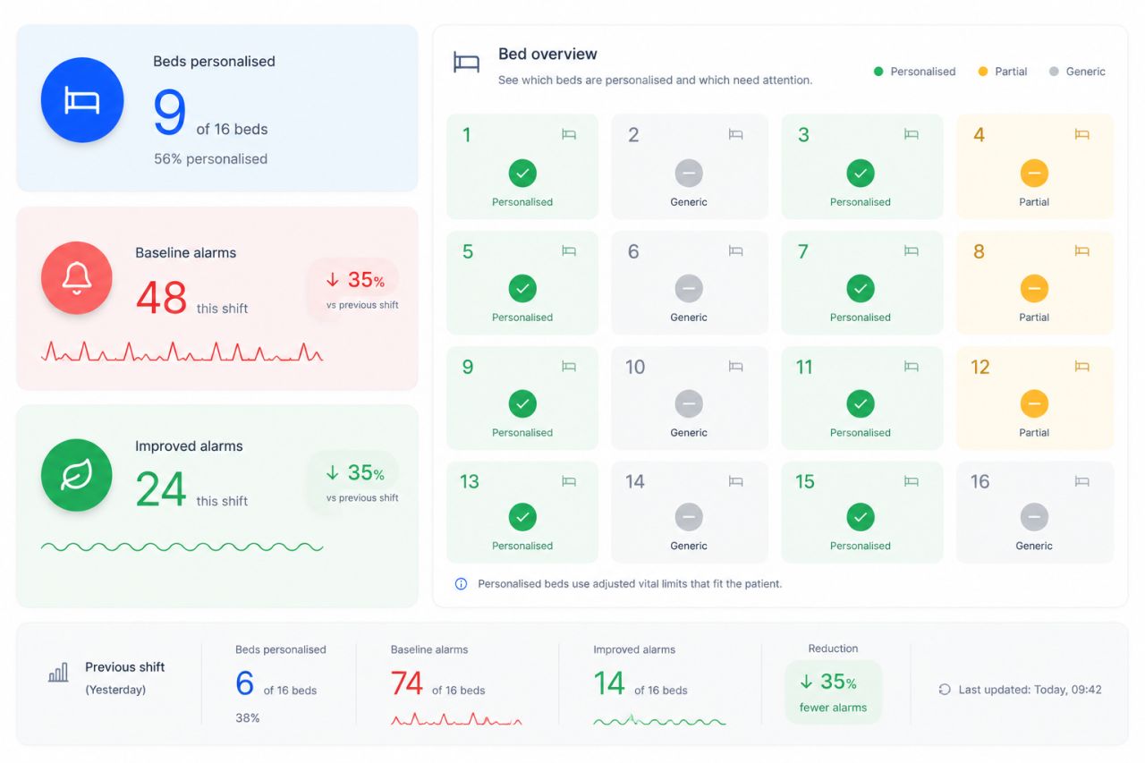
The central visual, the team's data direction. An ambient display at the nurse station showing the share of personalised profiles this shift, broken down per bed and per parameter. Team progress, never individual scores. An early iteration used a smiley face that brightened or saddened with the alarm count. I pushed to drop it: a nurse who had fought through a hard shift could still be met by a disappointed face, turning support into blame. The reworked version reads at a glance and answers to the work, not the other way around.
07 · Co-creation and testing
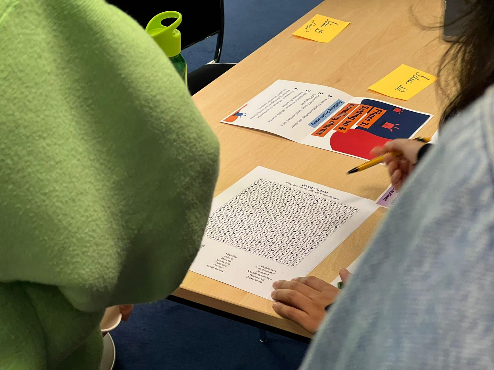
I did not wait for a finished prototype to test. I ran co-creation with OLVG staff and a mid-project critique while parts could still be discarded. That is where the smiley-face risk surfaced, early enough to act on. In the user test on 7 May, the visible status did something I had hoped for but not assumed: it started a conversation between a nurse and a doctor about whether to adjust a patient's limits. Doctors currently feel less responsible for monitor settings, and shared visibility pulled one back in. The nurse also asked, specifically, for bed numbers and the parameter at risk to be shown. That single request set the direction for what the visual had to become.
08 · The ethics were the design
Four directions were rejected, and they trace back to one principle. A leaderboard between nurses. A smiley face. A standalone app. Patient-context video, which OLVG confirmed was permitted, and which we set aside anyway as disproportionate. The principle underneath all four: a metric in a care environment must be answerable to the work it describes, not the other way around. I led the mapping of that reasoning onto GDPR, the Autoriteit Persoonsgegevens, KNMG guidance, and the slow creep from support toward control. The ethical work of a designer is not refusing or deploying a technology. It is deciding which restraints travel with the data.
09 · Why this matters beyond the ward
The strongest finding from testing has a business edge. The logic has to live inside the Philips IntelliVue ecosystem: adjust the limits on the monitor, and the bedside status and the station overview update on their own, so nothing is administered twice. And there is a strategic point I would put to a partner like Philips. Monitoring insight in hospitals almost always sits at physician or department level. Alarmease produces nurse-level, workflow-level behavioural data: which beds are personalised, which parameter is generic, how alarm burden shifts per team per shift. That is the level where alarm fatigue is actually made, and where it can actually be reduced. No patient data is touched. Only profile-setting behaviour.
10 · What the project changed in how I work
My process used to start from intuition and converge on an artefact. I would draw a thing, refine the thing, and defend the thing, and evidence came in afterwards to support what I had already decided. Now it starts from a framing decision, what the real leverage point is, and the artefact is whatever follows. The artefact is allowed to be small if the framing is right. In Alarmease the smallest of the three parts, the side reminder, carries the most weight precisely because the framing decided what it had to do.
I will name a real weakness too. My instinct is to keep adding meaning to a design, a second reading, another layer. That produced strong concept work here but slowed the visual craft: my first central-visual iteration carried more meaning than a glance can hold. I now put work in front of peers earlier, before the visual is committed, to catch that pattern before it ships.
At a glance
One semester · Emergency department, OLVG-Oost
4 research source types · 14 peer-reviewed papers
3 prototype media: physical, ambient, paper
1 tested behavioural loop, validated in a formative user test
Outcome: shared visibility sparked nurse–doctor dialogue; direction set for monitor-level integration
Scope and honesty
A tested concept, not a deployed product. No alarm reduction or patient-safety outcome was measured; the evidence is directional. Figures shown in the nurse-station visual are illustrative. No patient data was used at any point. Only nurse profile-setting behaviour was in scope.
Team: Andyka Jonathan, Barbora Halanová, Negin Bokaei, Duco Boomsma. I led the framing and reframe, built the service blueprint, co-built the side reminder with Andy, designed the challenge cards, and led the ethical direction. The visual direction was led by the team.
Next project
In progressCurious about the thinking behind this? Read the bio or get in touch.